
A signal-led identity for healthcare intelligence.
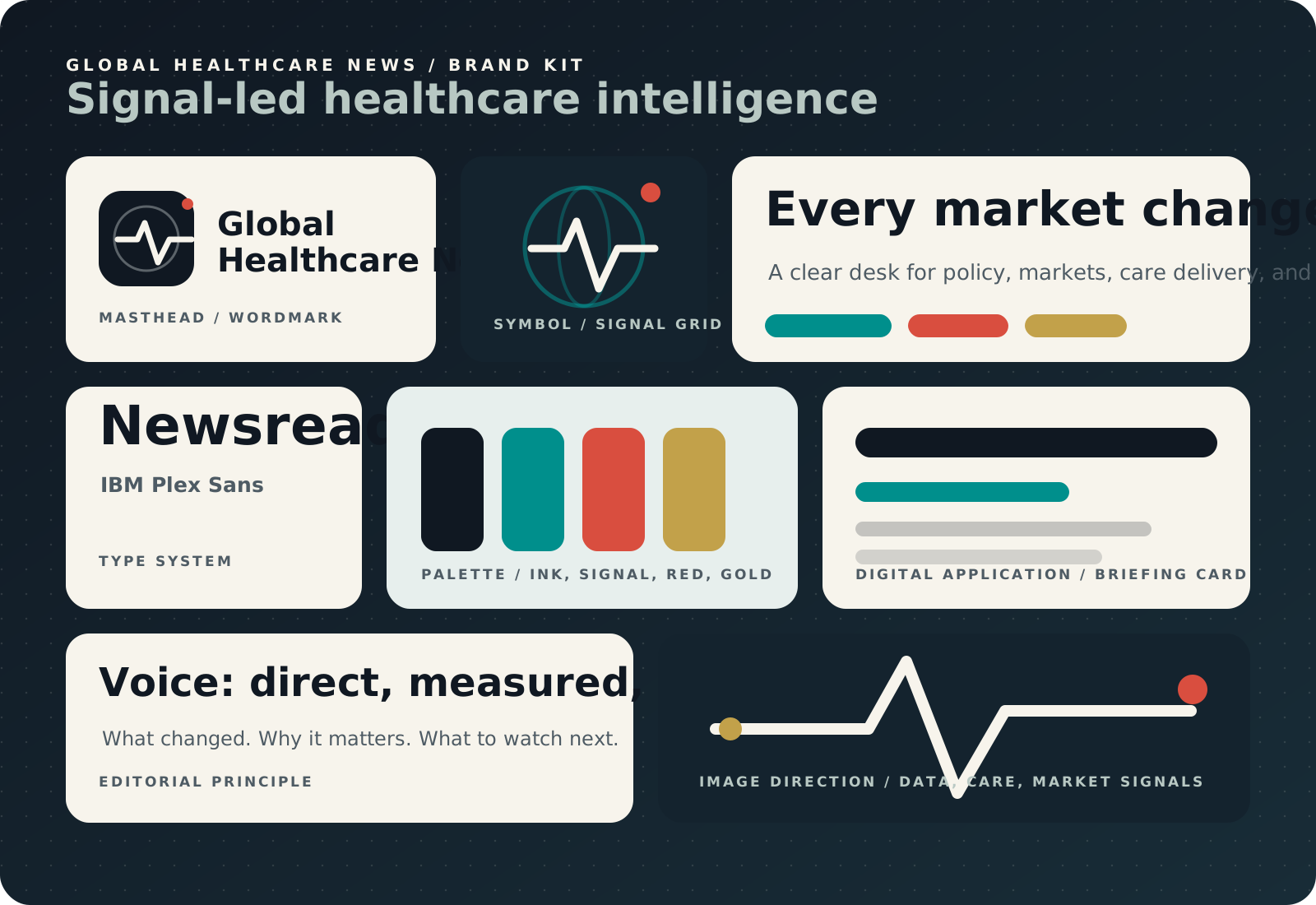
The system combines the strongest patterns in healthcare publishing: fast news scanning, executive-grade taxonomy, newsletter clarity, and a more ownable visual language.
Signal ink
Primary text, masthead depth, and high-trust structure.
#101822
Clinical signal
Primary accent for links, active states, and data highlights.
#008F8C
Briefing red
Secondary accent for urgent labels, alerts, and campaign marks.
#D94E3F
Briefing paper
Primary background for clean reading and long sessions.
#F7F4EC
Policy gold
Restrained support color for reports, seals, and premium details.
#C2A14A
Data mist
Surface color for archive cards, tables, and quiet dividers.
#E7EFED
Logo system
The mark combines a globe orbit, a pulse line, and a data node. Use the full wordmark for headers and footer placement. Use the compact mark for favicons, social avatars, and small badges.
Typography
Newsreader carries the editorial voice in headlines. IBM Plex Sans carries navigation, metadata, forms, and dense archive surfaces. Keep headline line lengths tight and article text readable.
Voice
Write in plain, specific language. Prefer "what changed" and "why it matters" over promotional claims. Avoid panic, hype, and vague market language.
Image direction
Use editorial healthcare imagery, abstract data maps, laboratory detail, hospital operations, policy rooms, and device closeups. Avoid generic stock teams and overly polished wellness imagery.